
My role
I was the sole product designer on this project, responsible for the full UX and UI from the first iteration onward. I worked closely with product management to translate detailed specifications into clear workflows, interaction patterns, and usable interfaces. My work covered system structure, interaction design, and the final visual execution across desktop and mobile.
Involvment
UX · UI · Interaction design · Mobile adaptation
Year
2025
THE CHALLENGE
What we built
This project covered the first UX and UI iteration of a B2B SaaS inventory management system used for daily operational work. The system included stock tracking, stock movement history, orders, transfers, product and variant management, and full mobile functionality.
Product requirements and business logic were defined in detailed PM specification documents. My role focused on turning those requirements into clear workflows, consistent interaction patterns, and usable screens across desktop and mobile.
SCOPE & CONSTRAINTS
Rules everywhere
The system consisted of several interconnected areas sharing the same inventory data but serving different operational needs. Requirements were extensive and rule-driven, with many edge cases defined upfront.
The focus of this iteration was not to redesign product logic, but to translate it into something people could use, understand, and extend safely in later iterations.
THE CORE CHALLENGE
From insights to action
The specifications described what the system should do, but not how users would work with it across different contexts. A large part of the work involved reviewing specs together with the PM, asking practical questions, resolving ambiguities, and shaping system rules into concrete user actions and flows.
FIRST ITERATION FOCUS
Foundations first
This phase focused on establishing a solid foundation:
- Making inventory behavior consistent across the system
- Making stock changes understandable and traceable
- Clarifying how products, variants, and categories relate
- Delivering usable desktop and mobile interfaces
Visual polish and advanced optimizations were intentionally secondary to clarity and consistency.
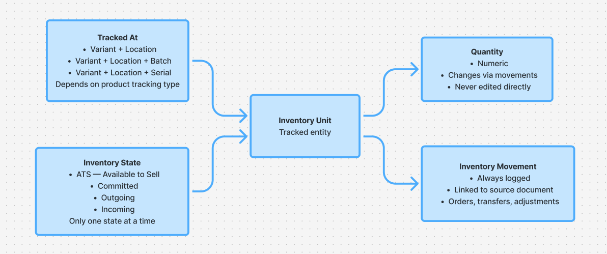
INVENTORY MENTAL MODEL
What stock is
Inventory logic already existed at the product level. UX work focused on clarifying how that logic appears to users: what stock represents, where it exists, how its status changes, and how those rules remain consistent across different workflows.
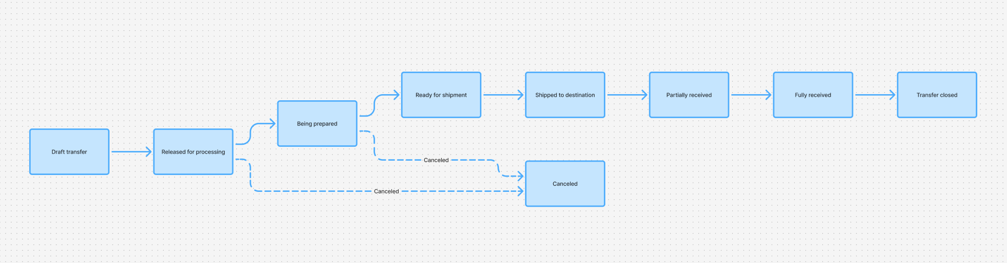
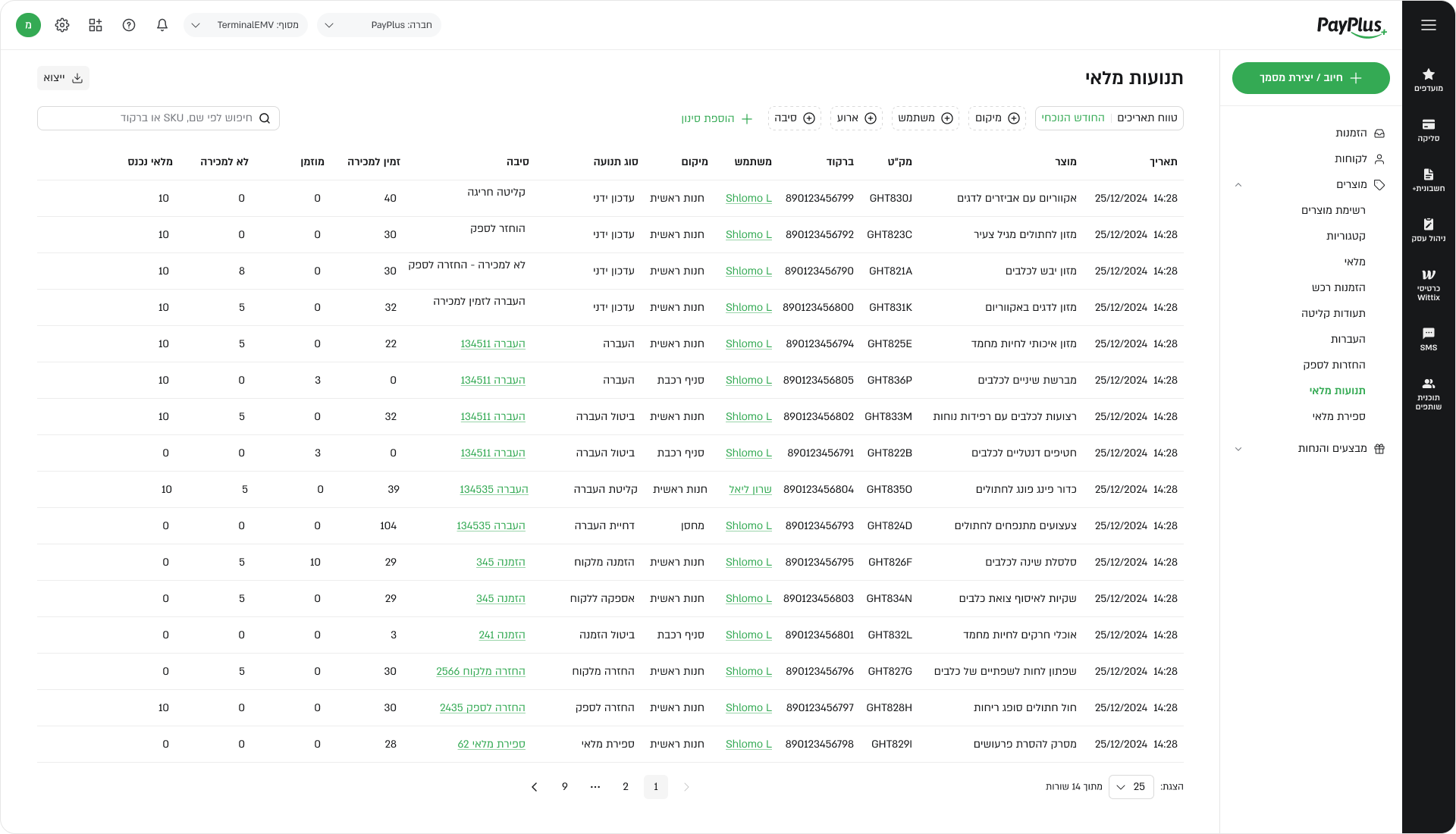
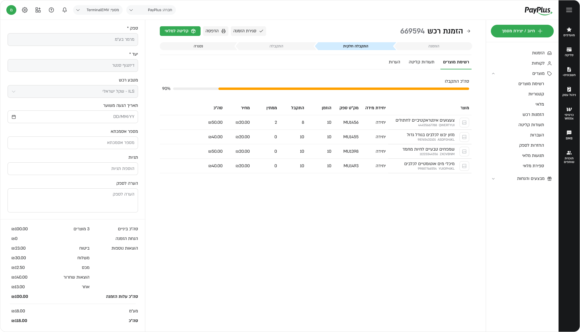
STOCK MOVEMENT
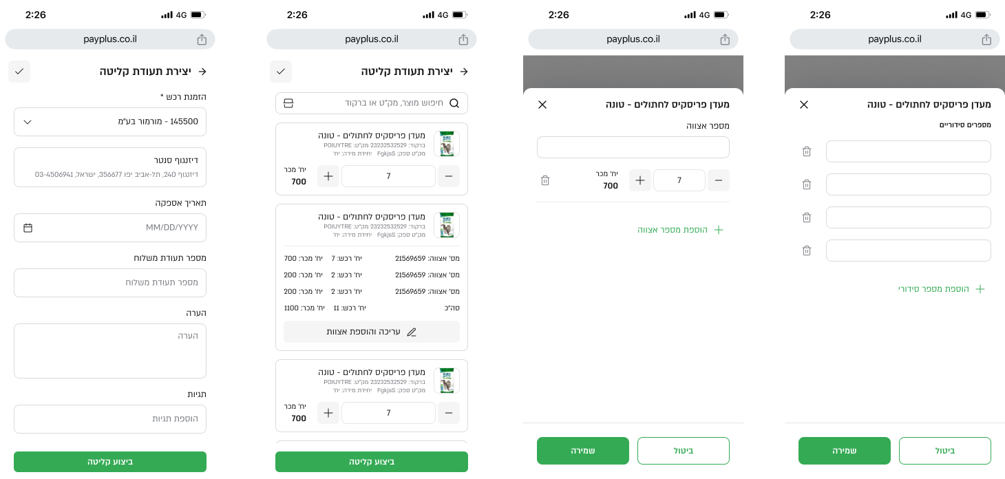
Why it changed
The system tracked every stock change in detail. UX and UI work focused on presenting this information in a way that helps users understand why stock changed, not just display raw events.
Movement history was structured and labeled so users could trace actions across orders, transfers, and adjustments with confidence.
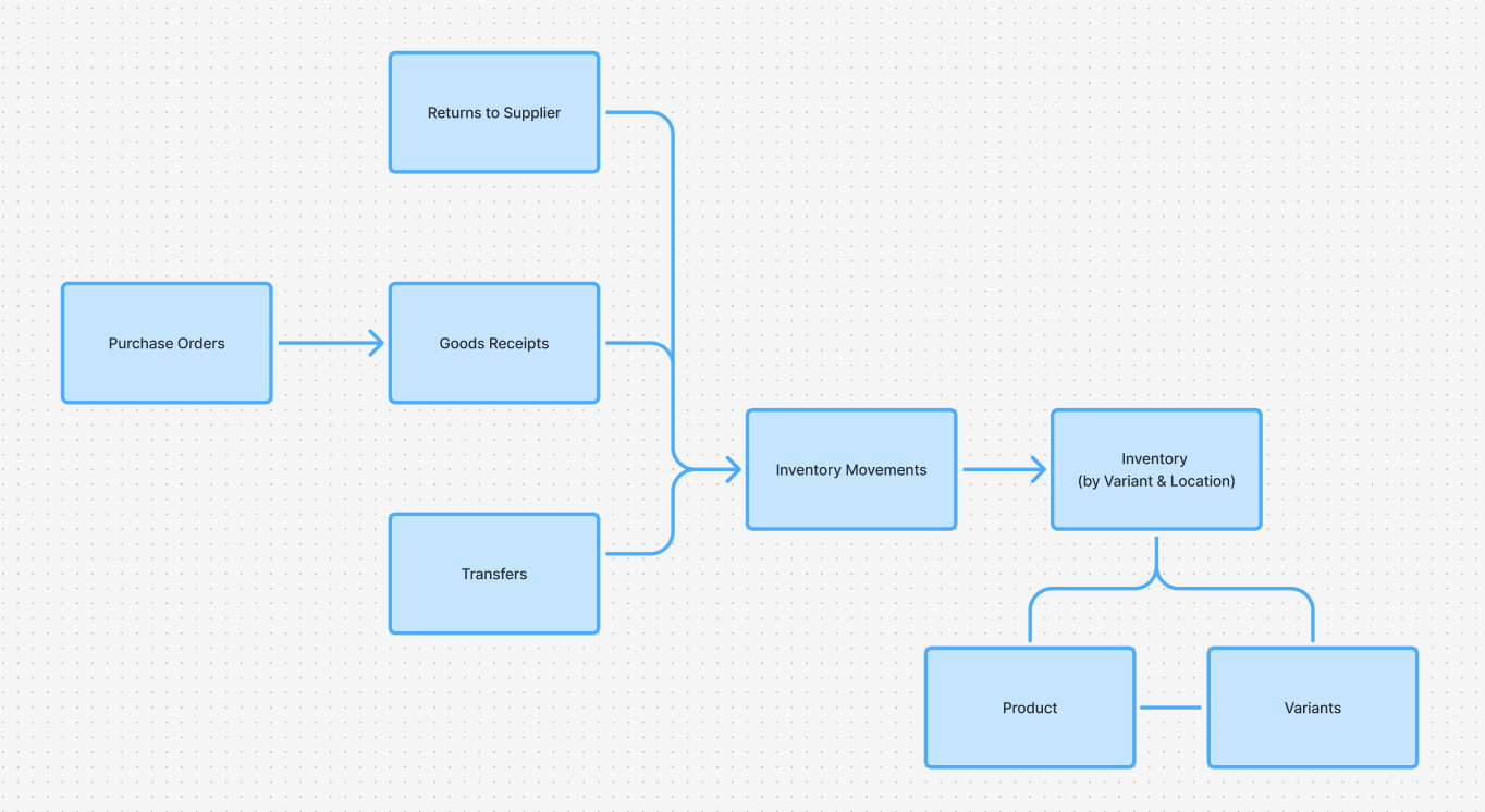
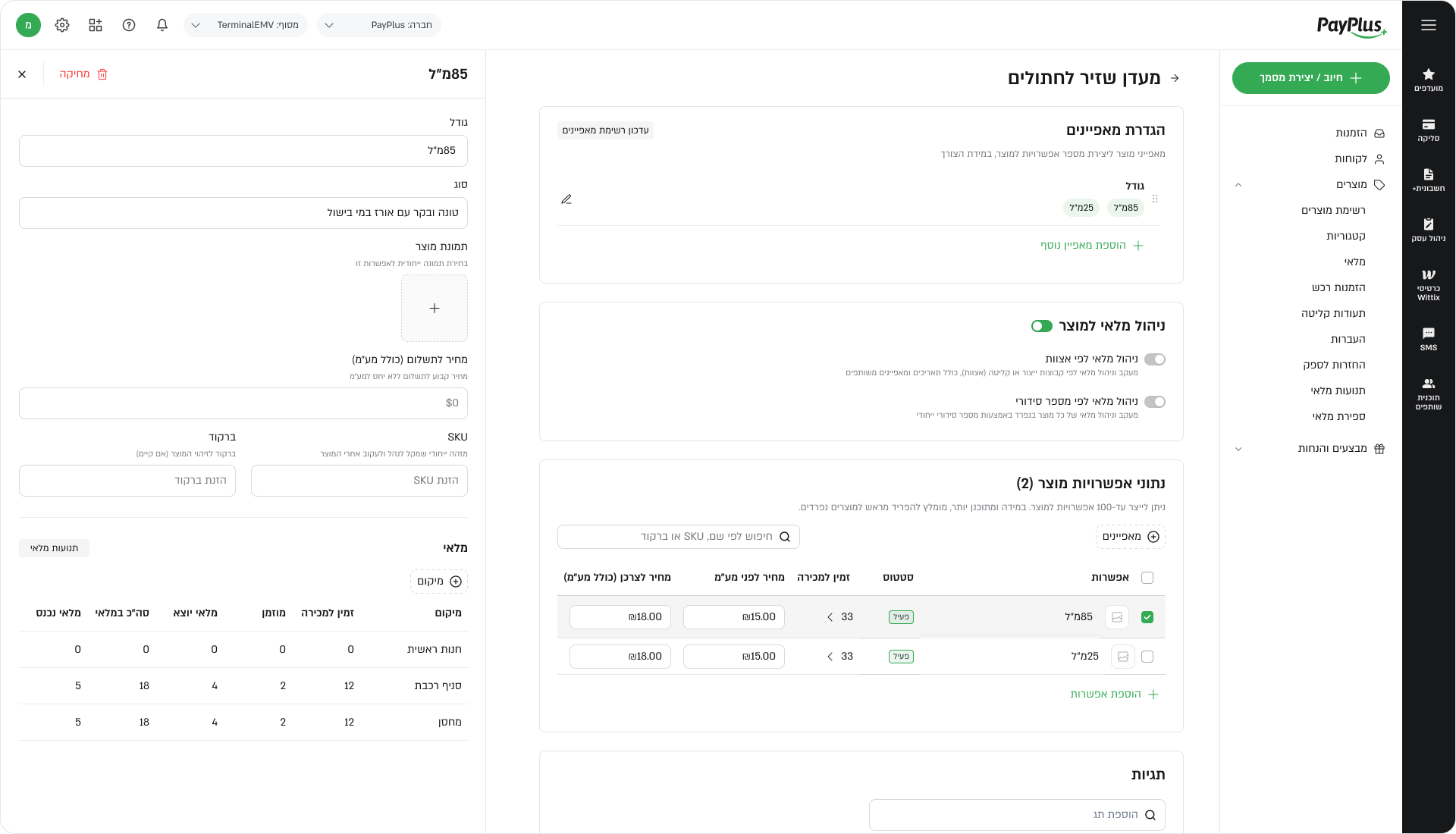
PRODUCTS, VARIANTS & CATEGORIES
Structuring complexity
Product structure was defined in the specifications, but needed clear representation in the interface. UX and UI work focused on separating responsibilities: where products are defined, how variants are managed, and where users view stock, without duplicating logic or increasing cognitive load.
CROSS-MODULE CONSISTENCY
Same rules everywhere
Because users move frequently between orders, transfers, stock views, and product pages, consistency was critical. Interaction patterns, statuses, and actions were aligned and reused to reduce learning effort and errors.
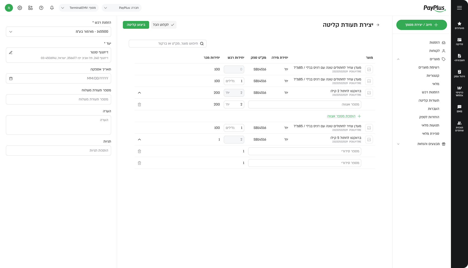
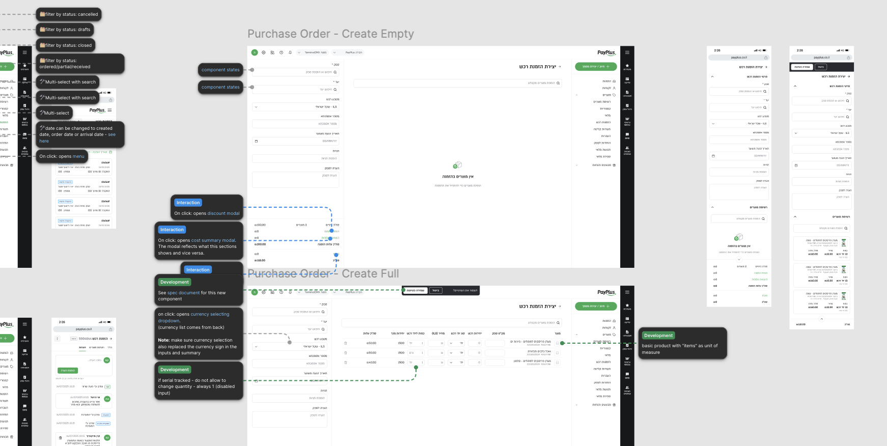
DESKTOP & MOBILE
Tables to cards
Mobile was designed as a first-class operational surface, supporting the same functionality as desktop. To adapt dense table-based data to smaller screens, desktop rows were translated into mobile cards while preserving data, states, and actions.
UX decisions focused on information hierarchy and safe interaction. UI work focused on readability, touch targets, and consistent visual language.
DELIVERABLES
What shipped
The first iteration resulted in flows, interaction models, and a full set of desktop and mobile screens aligned with the design system. These outputs supported development and enabled future iterations without reworking core concepts.
WHAT CAME NEXT
Room to grow
By the end of this phase, the system had a clear and consistent UX structure and a usable UI across platforms. Open questions were resolved early, and future work could focus on refinement rather than foundational alignment.
 Dalia Lev - Portfolio