In compliance with my NDA, I have modified and obscured confidential information in this case study. This content reflects my own perspective and does not necessarily represent the views of Blo Delek.
My role
As the lead product designer on this project, I was responsible for overseeing the entire design process from start to finish. My contributions included conducting in-depth system and user research, defining UX specifications, creating wireframes, and building a comprehensive design system. I also developed the final user interface and supported the development process.
Involvment
Research
Wireframing
Design
Year
2021 – 2022
THE CHALLENGE
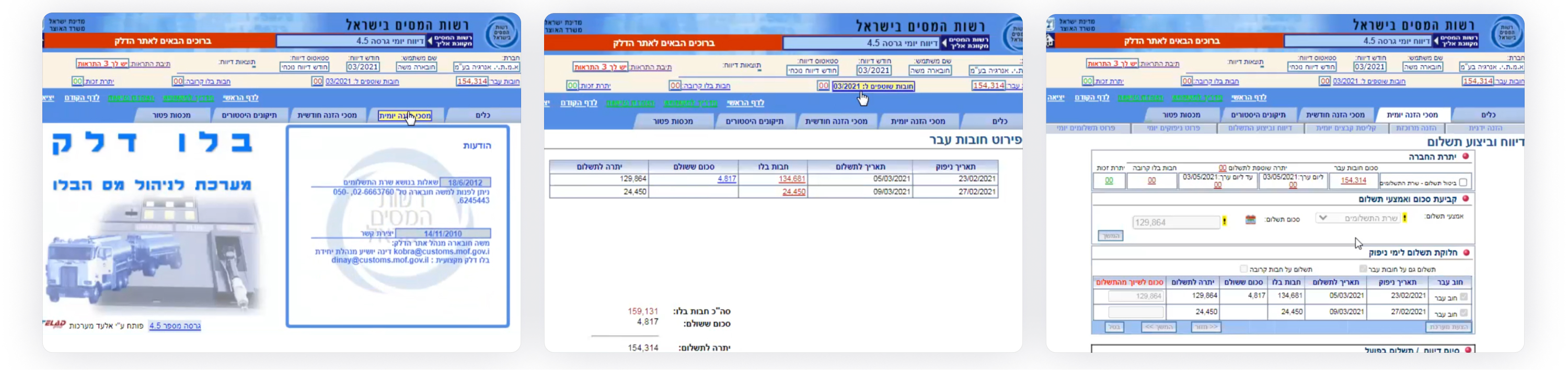
Old system, new life
The existing system was complex, outdated, and challenging to navigate, leading to frustration among users. Employees of large and small fuel providers, as well as storage facilities, struggled with submitting and paying excise taxes efficiently, often leaning heavily on the support of the Blo Delek team to achieve their daily goals.
The goal was to create a more modern, user-friendly platform that streamlined the process and allowed users to work independently, while preserving the established workflows that users were accustomed to.

DISCOVERY
Learning the ropes
We began by deeply understanding the existing system and its user base. We had no prior knowledge about excise taxes, so we needed to learn extensively about the domain. Working closely with the client, we mapped out the system’s functions and the business processes involved in excise taxation, and then dove into the research.
Key steps included:
Stakeholder Interviews
We conducted interviews with key stakeholders, coming up with valuable insights:
- A deep understanding of the system and the overall business processes involved.
- The key pain point of the team having to manually support users through unique tasks and daily operations.
- Segmenting the users into large fuel providers, small fuel providers, and fuel storage facilities.
Usage Data Analysis
By examining existing usage statistics, we identified the most frequently accessed parts of the system, and the neglected ones.
We also tried to understand which user segments were using which features so we can eventually figure out why some parts were not being used.
User Interviews:
We interviewed representatives from different user groups, including large and small companies as well as storage facilities.
Despite using the system for years, many users requested features that already existed but were difficult to find.
User Survey
We conducted a survey that confirmed common issues and highlighted additional areas for improvement.
Among others – it validated the interview findings: Features previously showed in data analysis as underused were apparently so because users were unaware of their existence.
Based on these insights, we created detailed user journey scripts and segmented users into three primary groups: large companies, small companies, and storage facilities.
THE PROCESS
From insights to action
Using our research insights, we moved into the design phase.
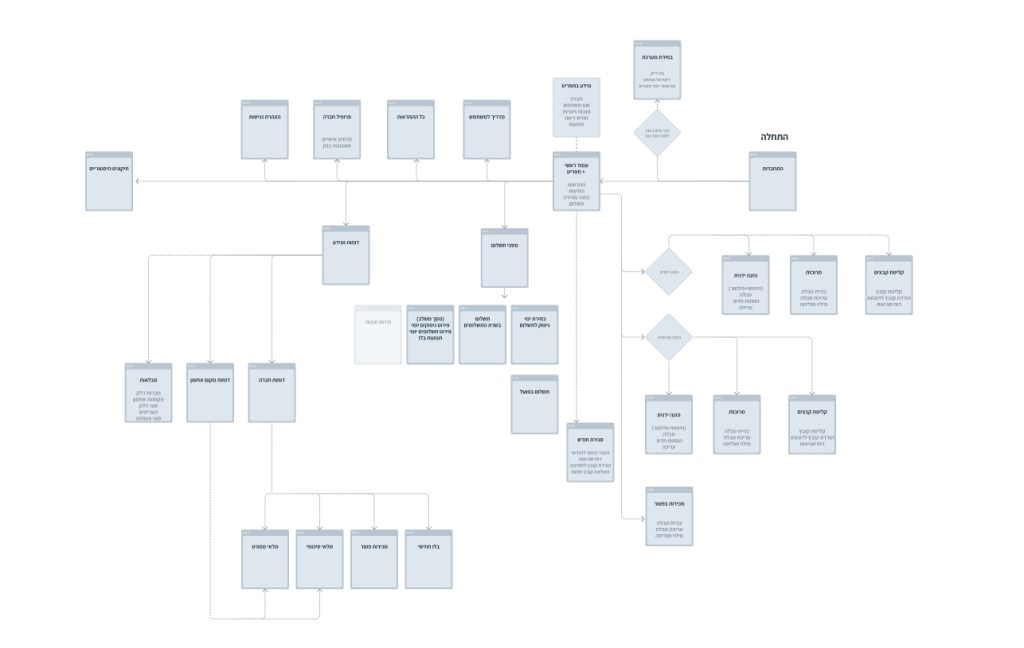
User flow
We started by drafting a flow of the new system architecture to streamline complex workflows while ensuring it aligned with user needs.
Wireframes & Specifications
We developed wireframes and mapped out specification for the system. Early sketches were shared with users to gather feedback and make iterative improvements.
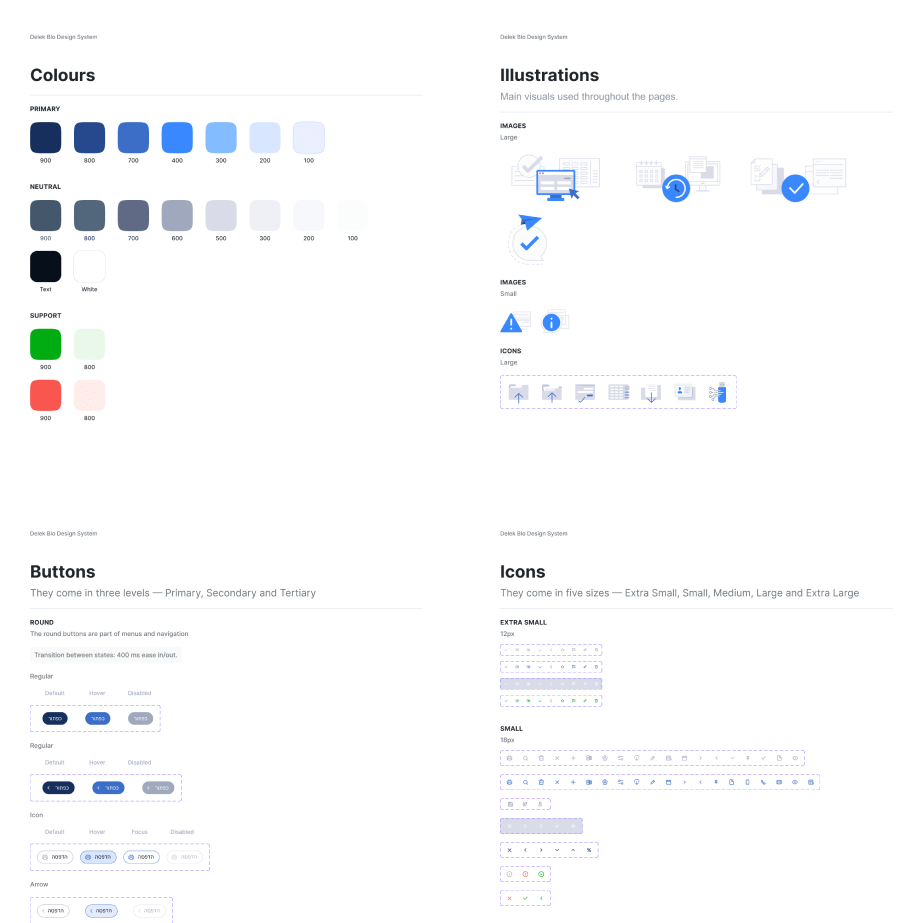
Design System
We developed a comprehensive design system for the project, drawing inspiration from other Israeli government sites.
This design system ensured consistency and scalability across the platform.

DETAILED DESIGN
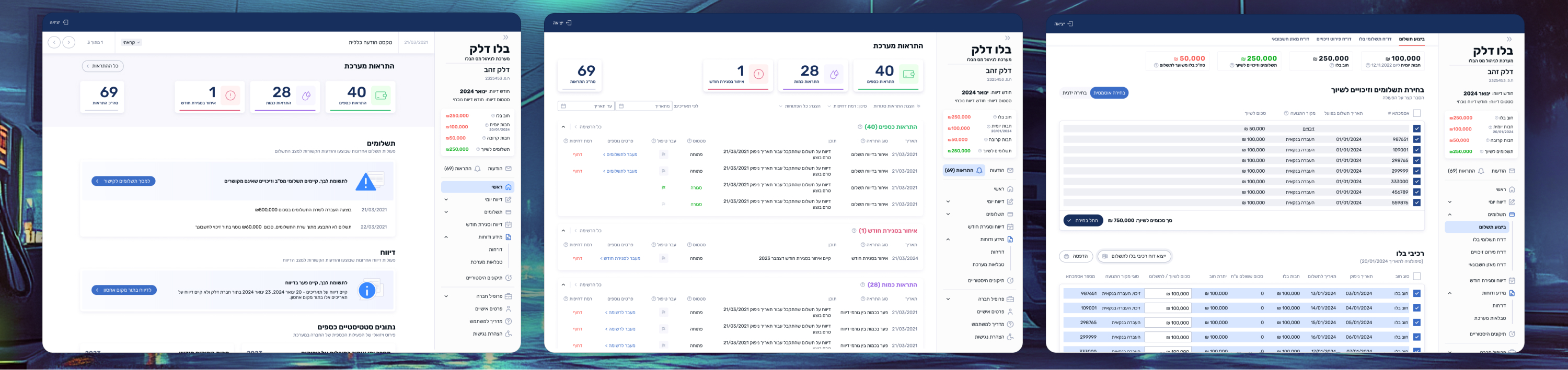
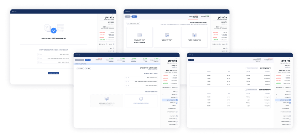
The final solution was a redesigned tax submission system that integrated familiar elements from the old system with a more intuitive interface. A better navigation system was introduced, allowing the user to find their way around.
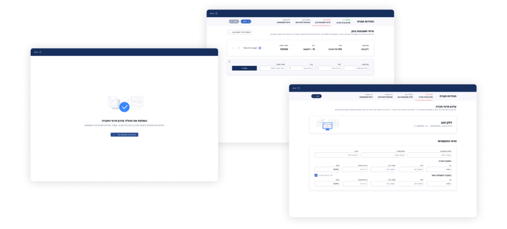
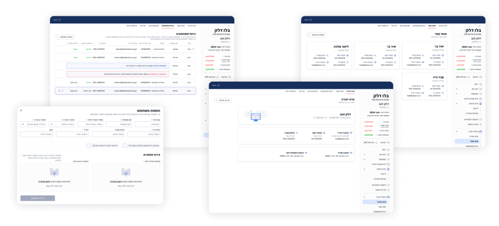
1. Onboarding process
A process for smoothly onboarding both a new company and a new user, validating known information and requesting missing details.
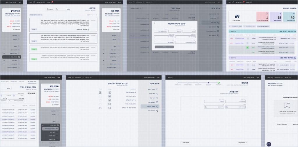
2. Main Screen – Dashboard
A new dashboard providing an overview of important tasks, pending actions and statistics, making it easier for users to track their tax submissions.
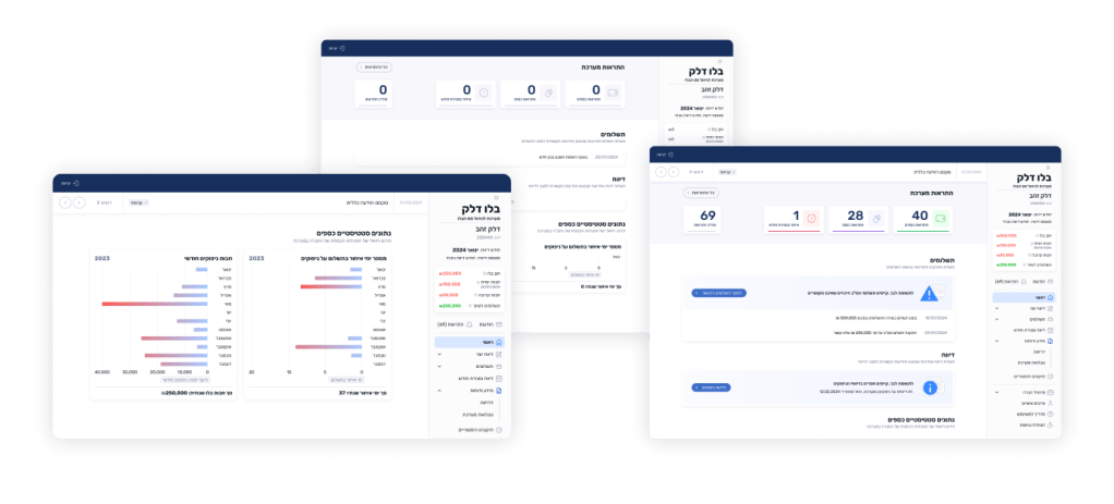
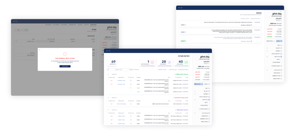
3. Messages and Alerts
We separated these types of communication into distinct areas. Messages are direct communications from the Blo Delek team, some requiring user validation. Alerts provide important information the system needs users to know. Previously, these were combined, which led to user confusion and neglect.
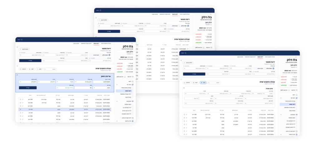
4. Daily Reporting
Daily reporting was possible through three features – all located in different places, without intuitive user access. We redefined those features into a single section, giving the users an opportunity to choose from:
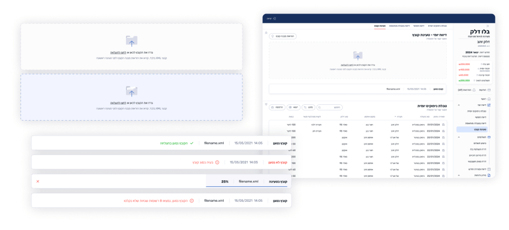
Manual report entry: For a limited number of reports, generally used by small companies. To improve efficiency, we added an option to fixate parts of the form for repeated use.
Adapted table: A bird’s-eye view of a day’s transactions, designed for larger companies to enter large quantities of data at once without direct system integration. This previously existing but underused feature was adapted to better fit user needs, spotlighted for easy access, and made more user-friendly.

File uploading: This feature, allowing users to upload a file from their internal management system, was previously underused due to lack of awareness. We improved the user experience by providing clearer error reports and instructions on connecting to their existing systems.
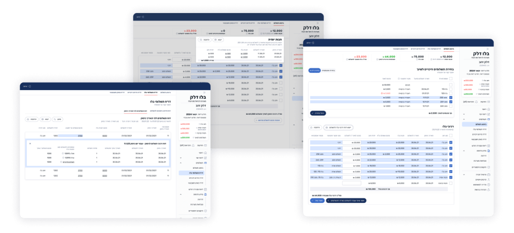
5. Monthly Reporting
This crucial process was previously grouped with daily reports, with several required stages scattered throughout the system. After analyzing the process, we realized it was used only once at the end of each month and consisted of multiple steps for the user to complete. We streamlined the process into a single, cohesive flow, allowing users to complete everything in one go. We reused familiar features from daily reports while adding new elements to enhance the experience.
6. Payments
We combined all payment information in one place, allowing users to view their previous activity, pay monthly dues, and assign payments and refunds to specific payment requests.
7. Admin section
This section allowed the main user of the company to independently manage employee access to the system (previously requiring manual entry from the Blo Delek team) and adjust company details as needed.
Looking back on the project, the big win was the teamwork between designers, developers, and stakeholders, making sure we hit the mark for both users and the business. Balancing fresh design with what users already expected was tricky, though. A bit more testing earlier on might’ve made it even better!
